Sale Design System Case Study
Overview:
Thinx is a brand that specializes in period underwear, which is designed to provide an alternative to traditional menstrual hygiene products like pads and tampons. The underwear has multiple layers of absorbent fabric to wick away moisture and prevent leaks. Thinx aims to offer a more sustainable and comfortable option for managing menstruation.
Creating the sale design system aims to enhance revenue whenever a sale occurs, utilizing original and innovative designs across the live site
Role & Responsibilities:
Lead Designer
2 person team (Trevor Probherbs, Kim Suchy)
Remote
Problem:
Sales are something that occurs several times throughout the year. Each sale demanded a design and over time, the visuals became repetitive and bland. We wanted to create a system that is timeless and innovative that will also increase sale revenue.
Solution:
We developed a more flexible and intentional approach to designing for sales on our website. This system draws together the needs of various teams to create a cohesive end-to-end user experience.
The ultimate intention is to increase sale revenue, encourage cross-brand shopping in a themed system, and to structure the collaboration between UX and Creative for an integrated visual approach to sales across all digital touch points.
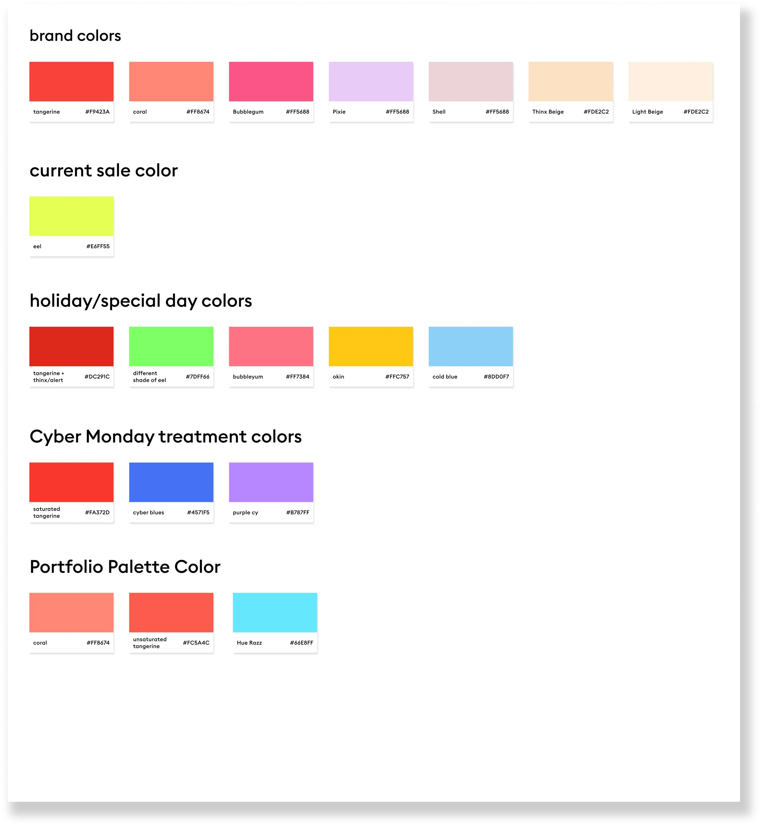
Color exploration:
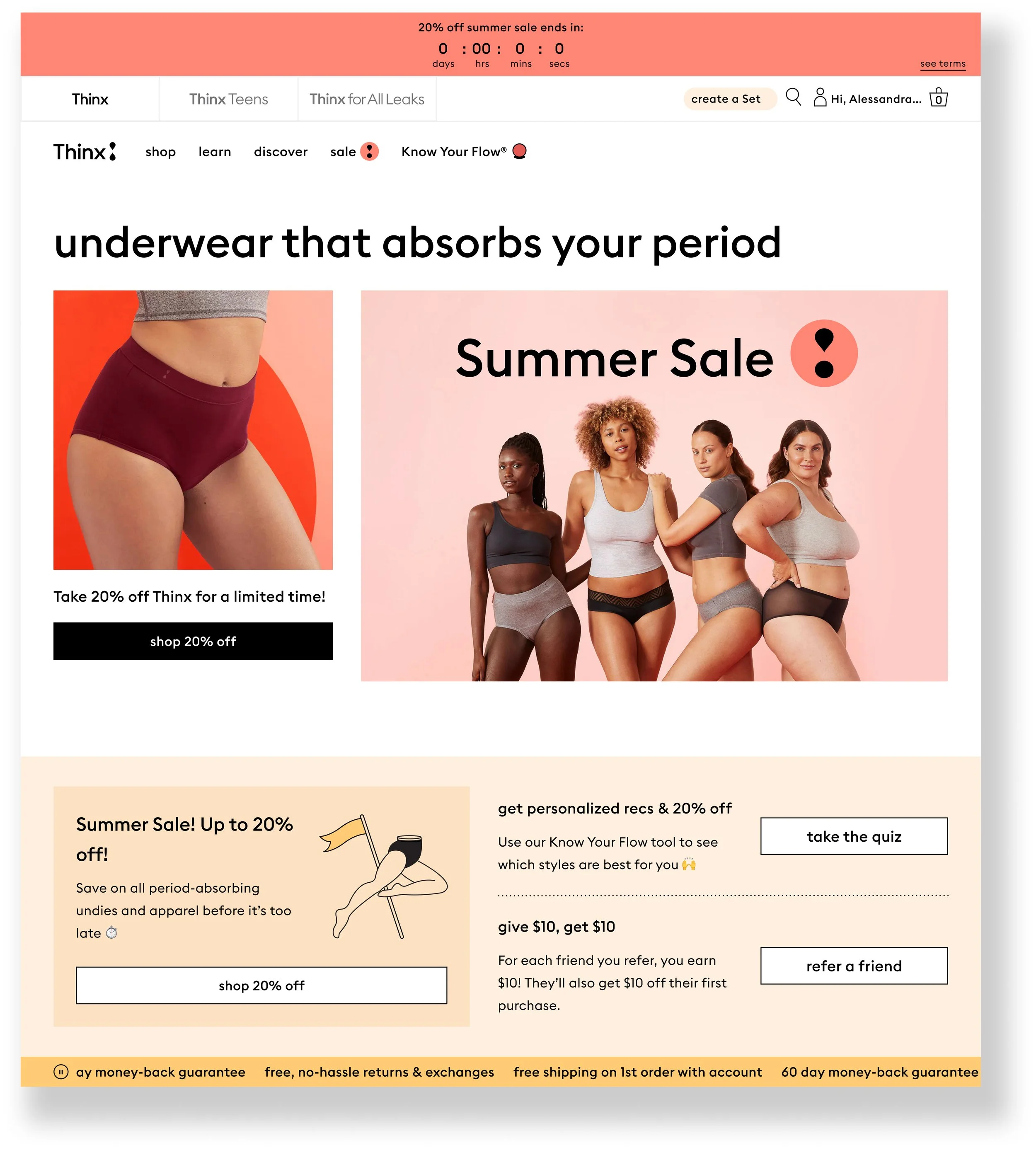
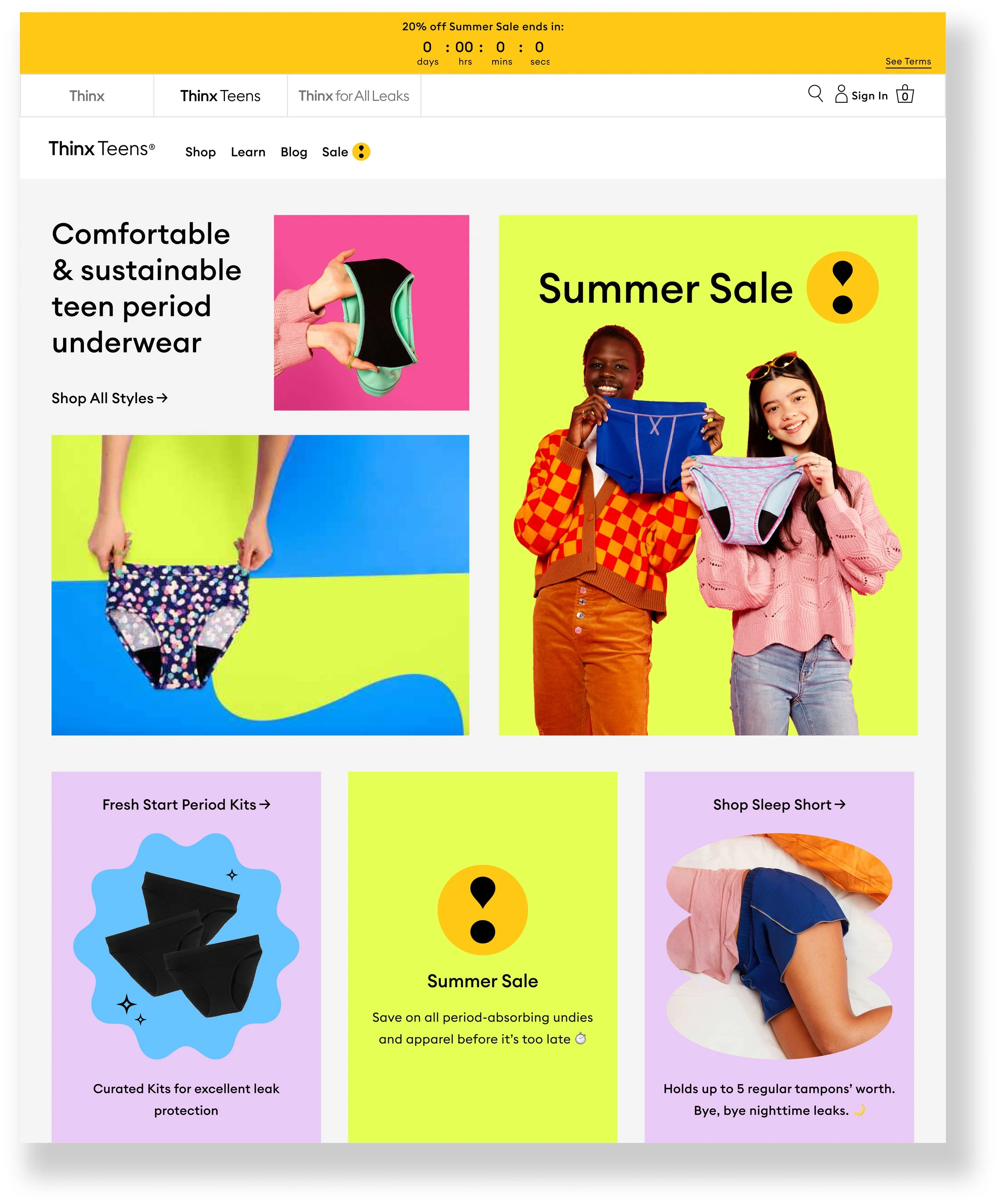
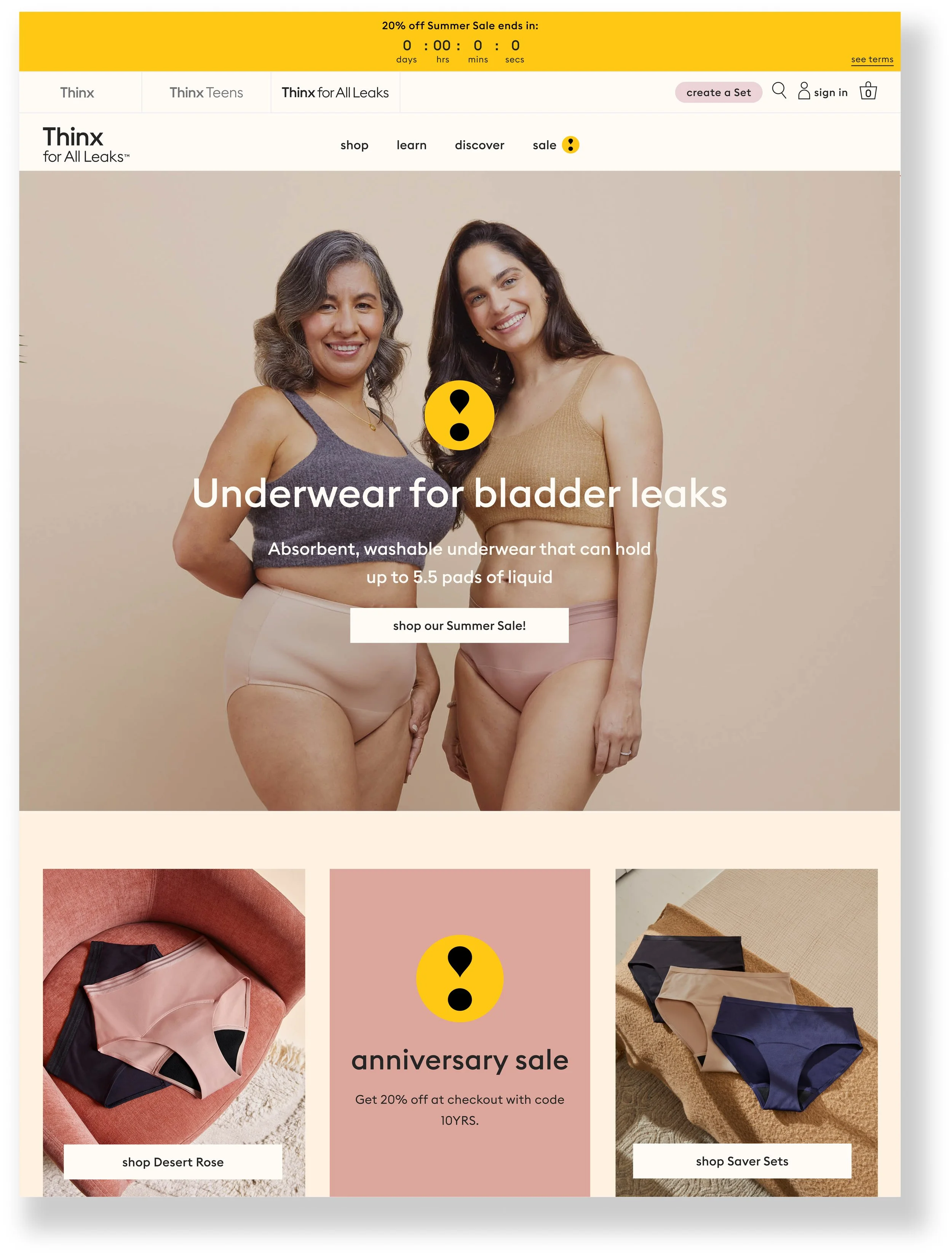
Thinx, Thinx Teens, and Thinx for All Leaks have their own brand color palettes that show up in image assets and evergreen website UI. Each sale is assigned a unique Sale Highlight color that will be used across ALL brand websites in sale-specific UI, and chosen by Creative/UX for each sale. We wanted to do a color exploration to determine what color to use as a default color if no new color is chosen.


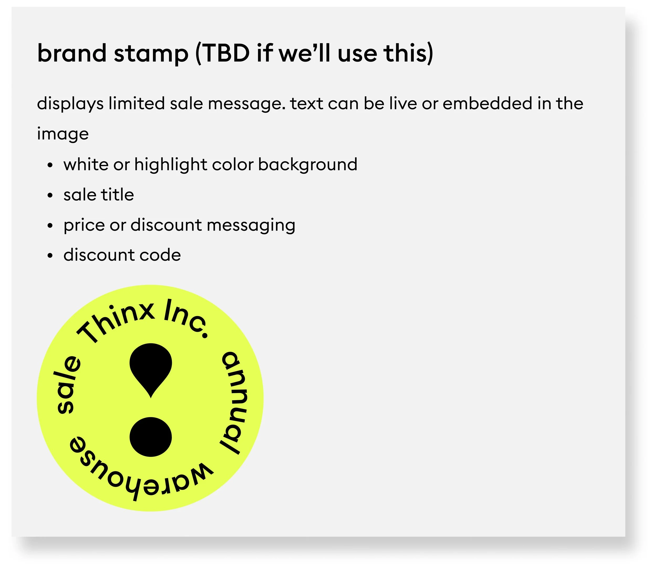
Sale Badge:
We wanted a symbol to signify to users that there is a sale going on. We wanted to create something unique to Thinx and its sale promotions. I used the symbol from the brand’s logo due to it being in the shape of an exclamation mark, and representing Thinx at
the same time.
Design explorations:
After working on the color palette and the logo asset for the system, we explored different design solutions for the ‘Above the fold’ and ‘Footer’ placements.
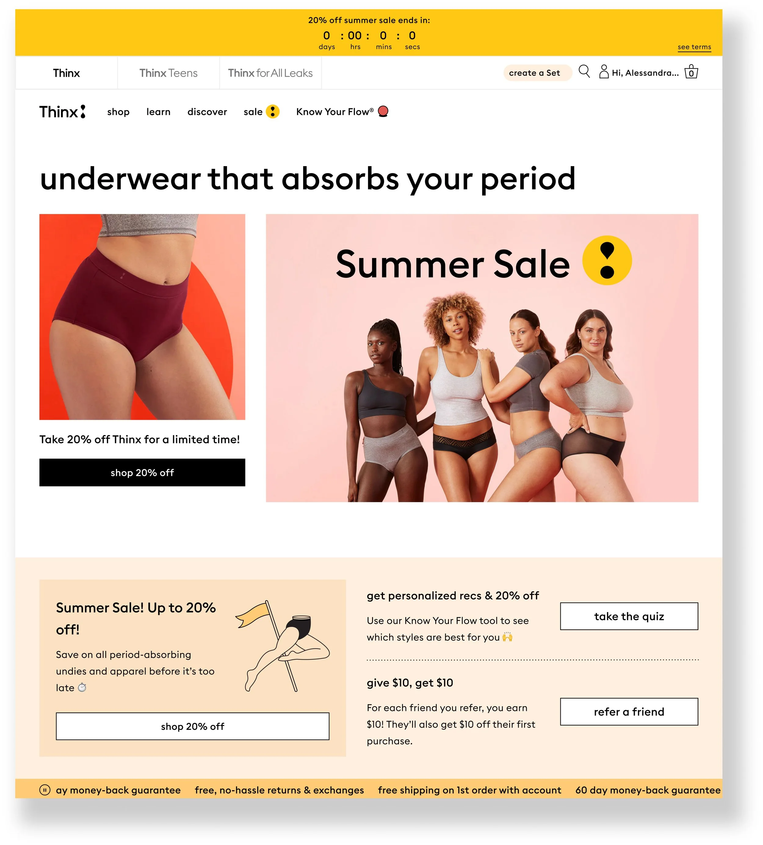
Above the fold


Footer

We decided to create different templates for the Creative team and the UX team to choose from for future sale promotions
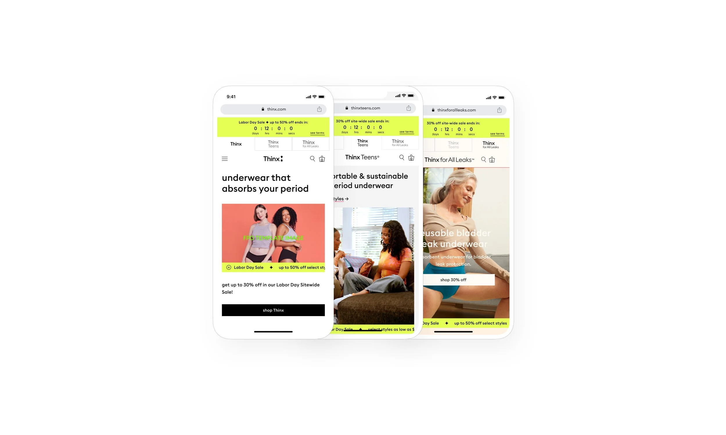
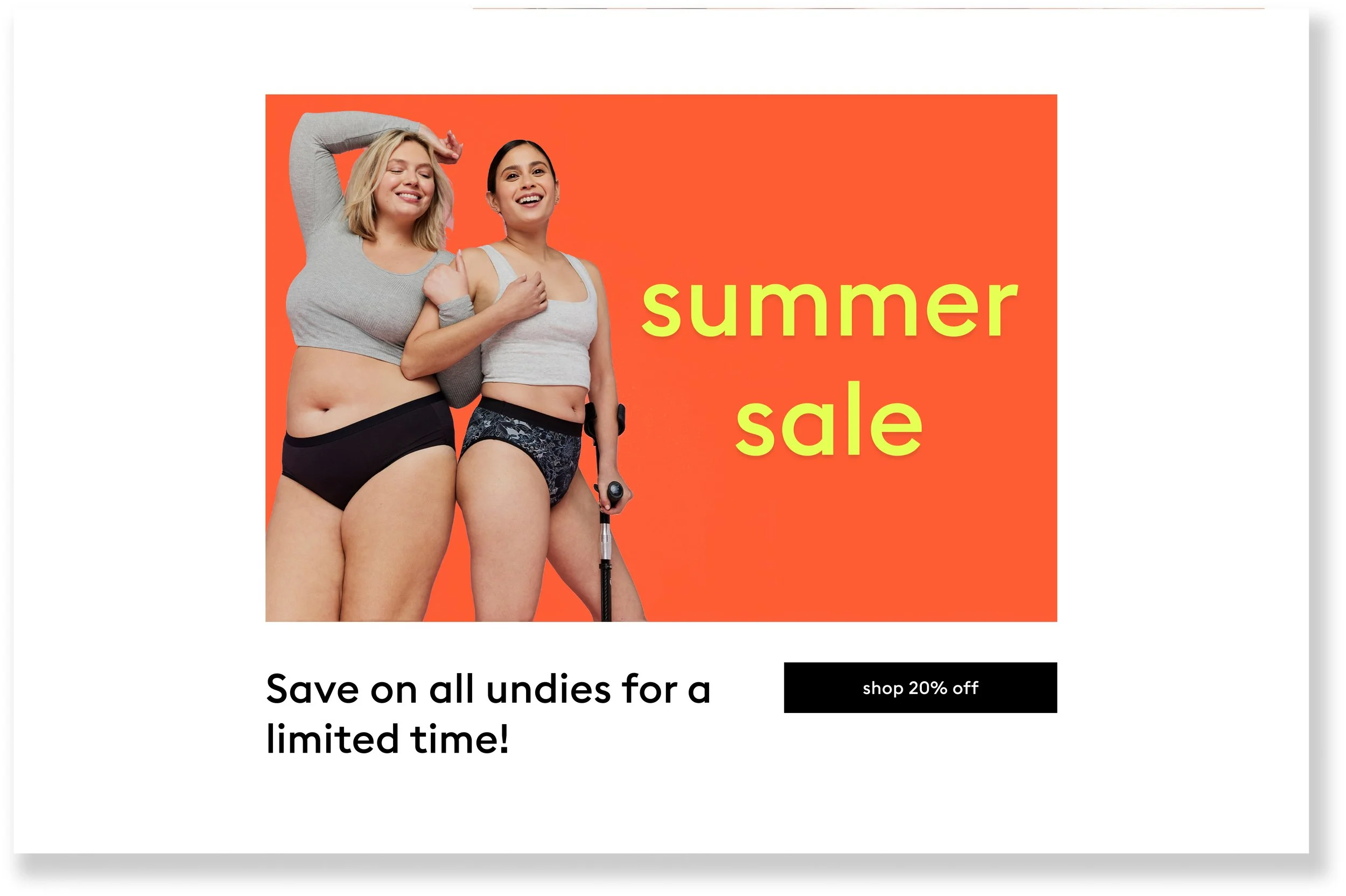
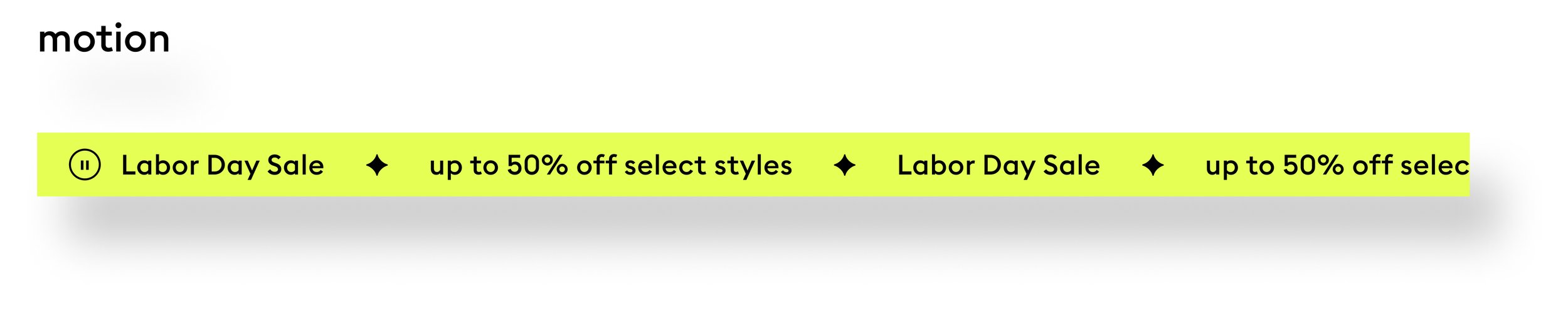
Marquee template:
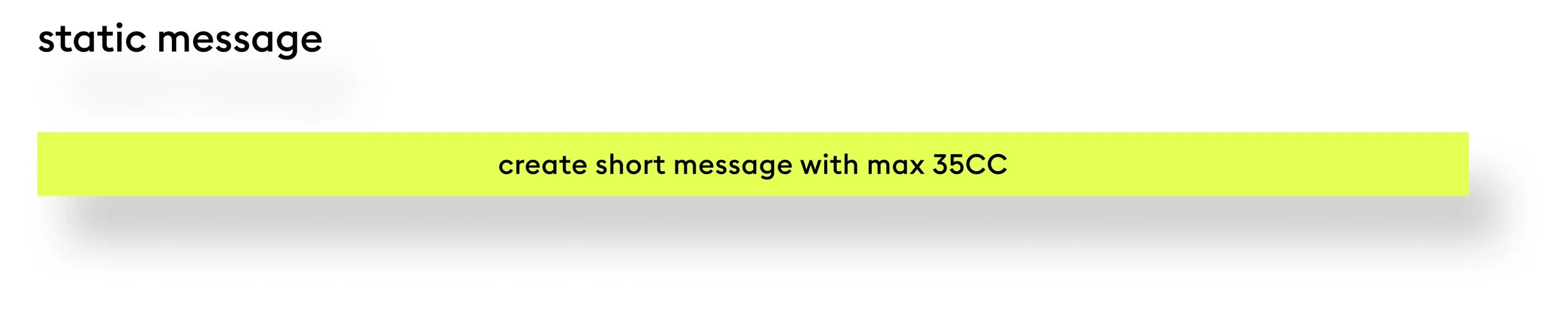
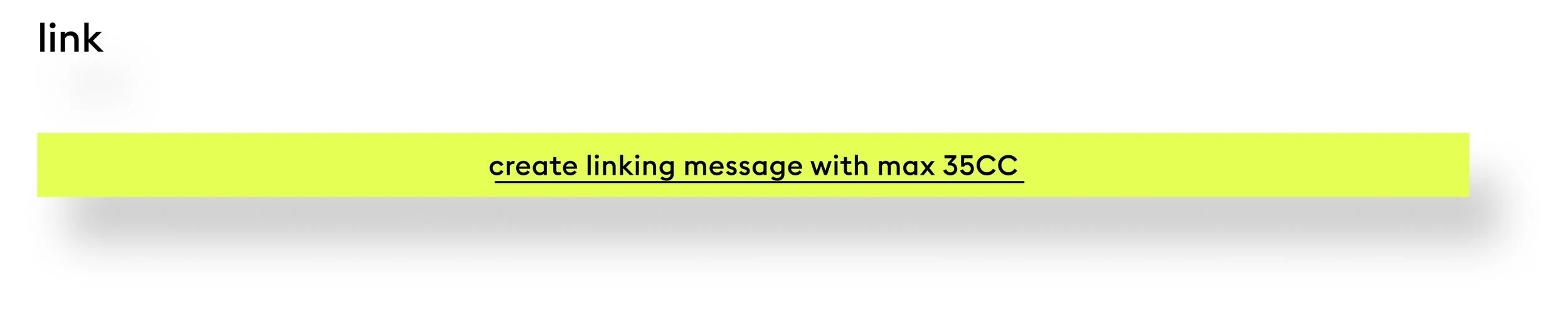
Sale messaging is displayed in a marquee that is sticky to the bottom of the primary hero image and the shop all promo section for all 3 brand homepages.
The marquee can hold:
motion: up to 3 messages that will scroll horizontally
a single static message
a single message that links
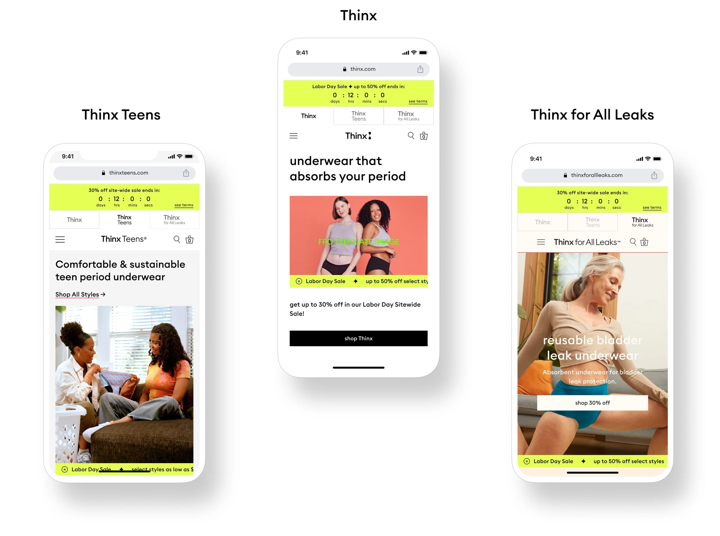
Mobile layouts
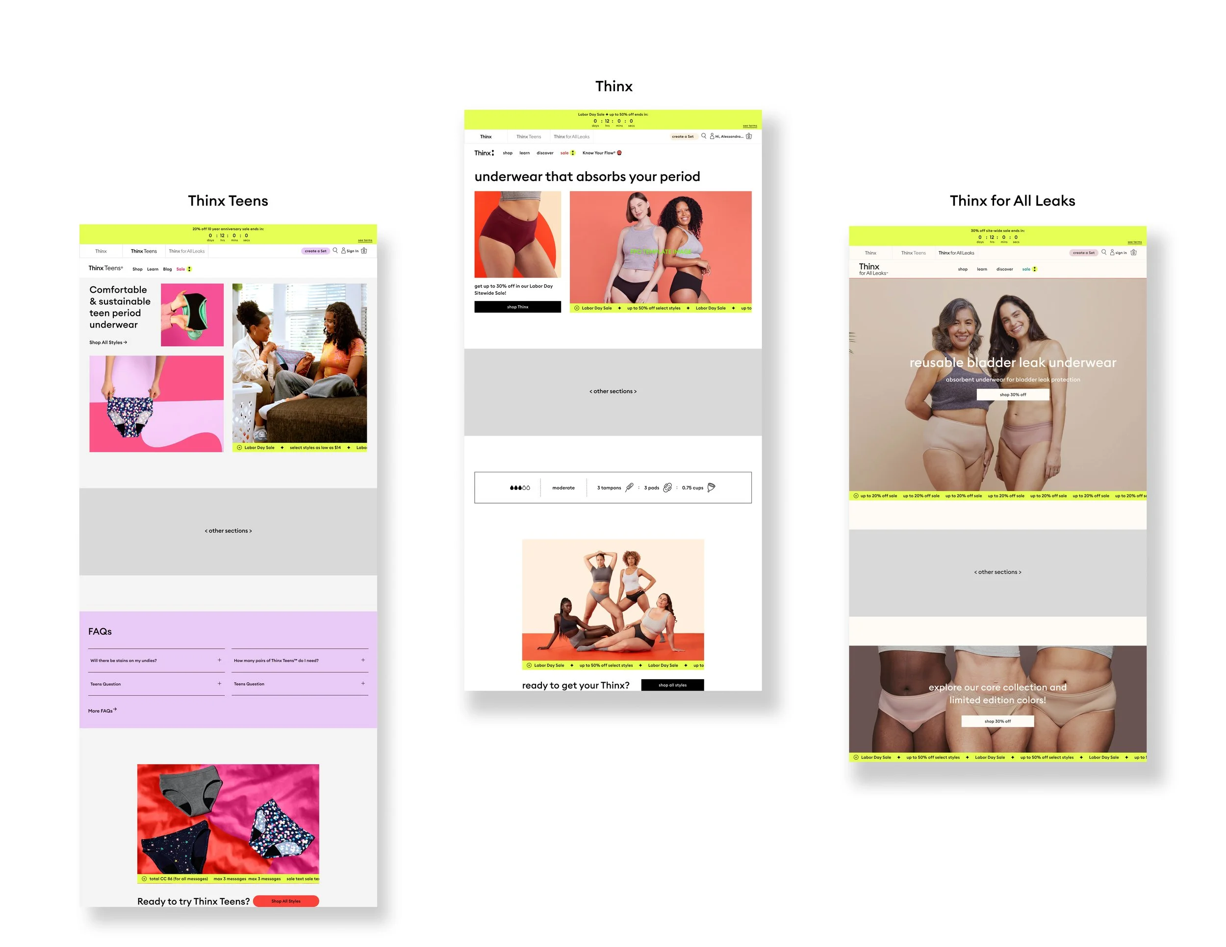
Desktop layouts
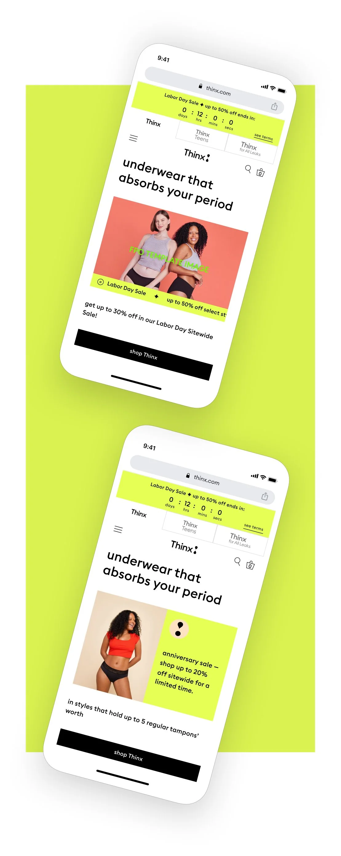
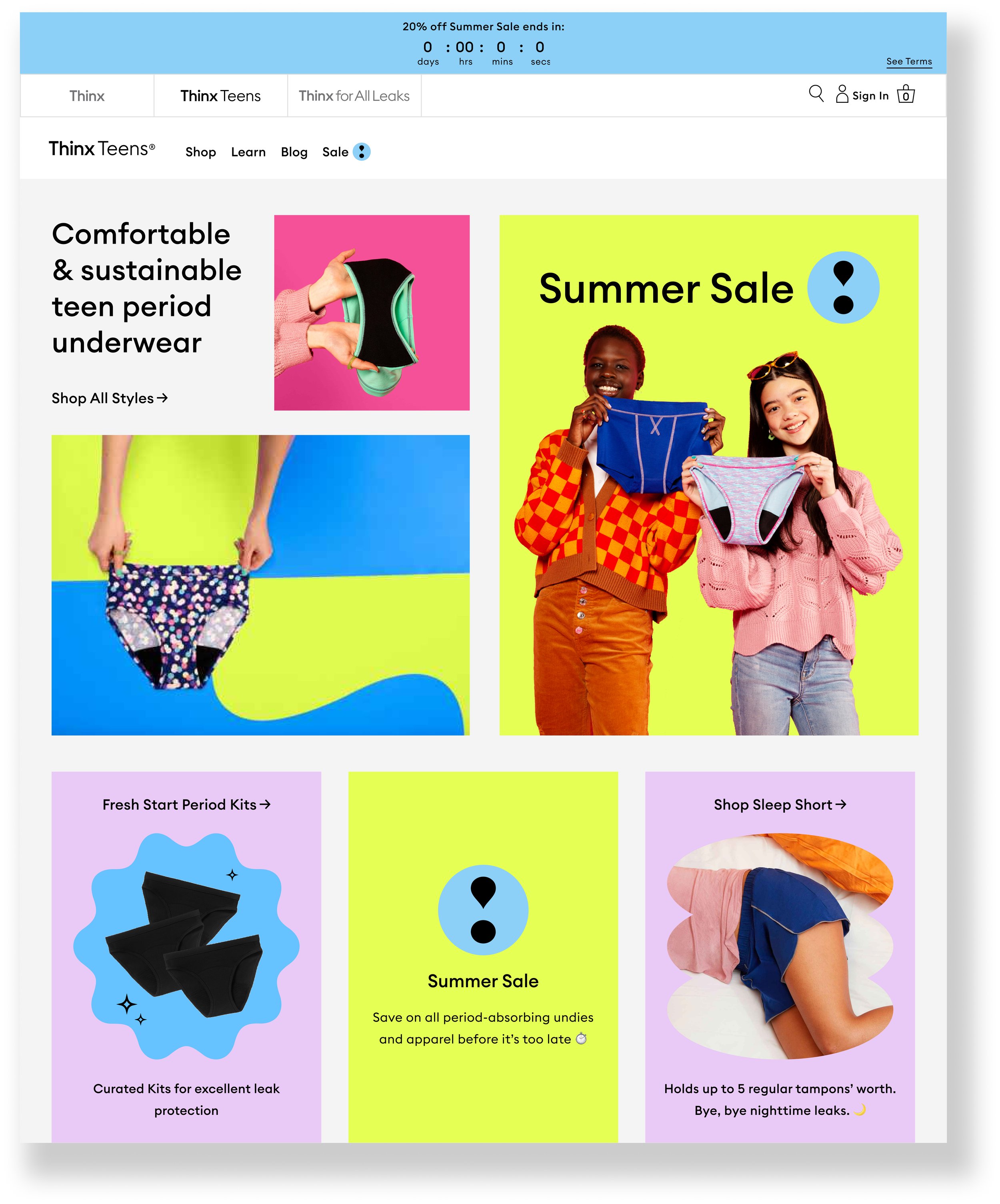
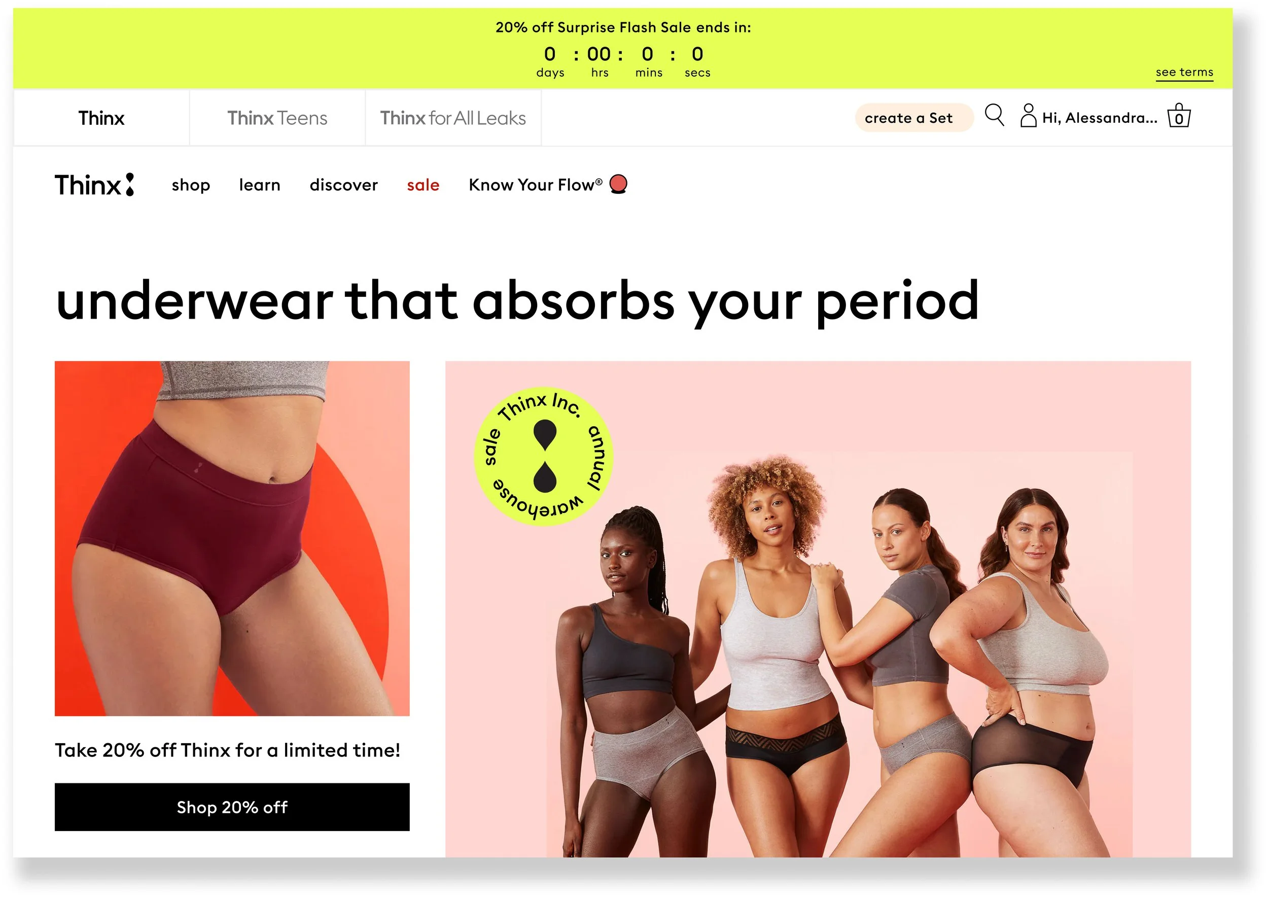
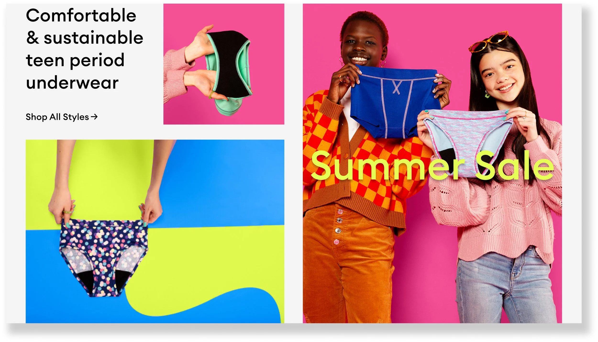
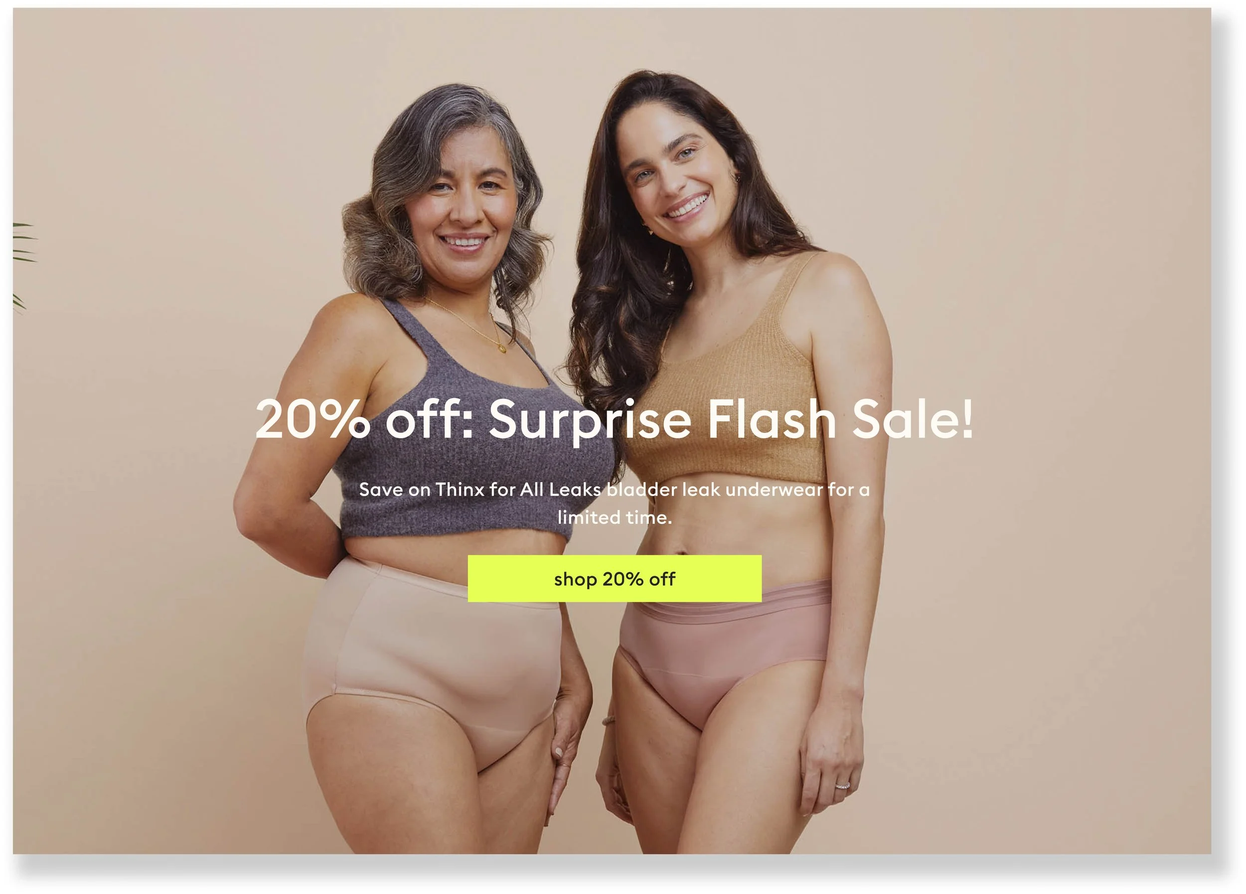
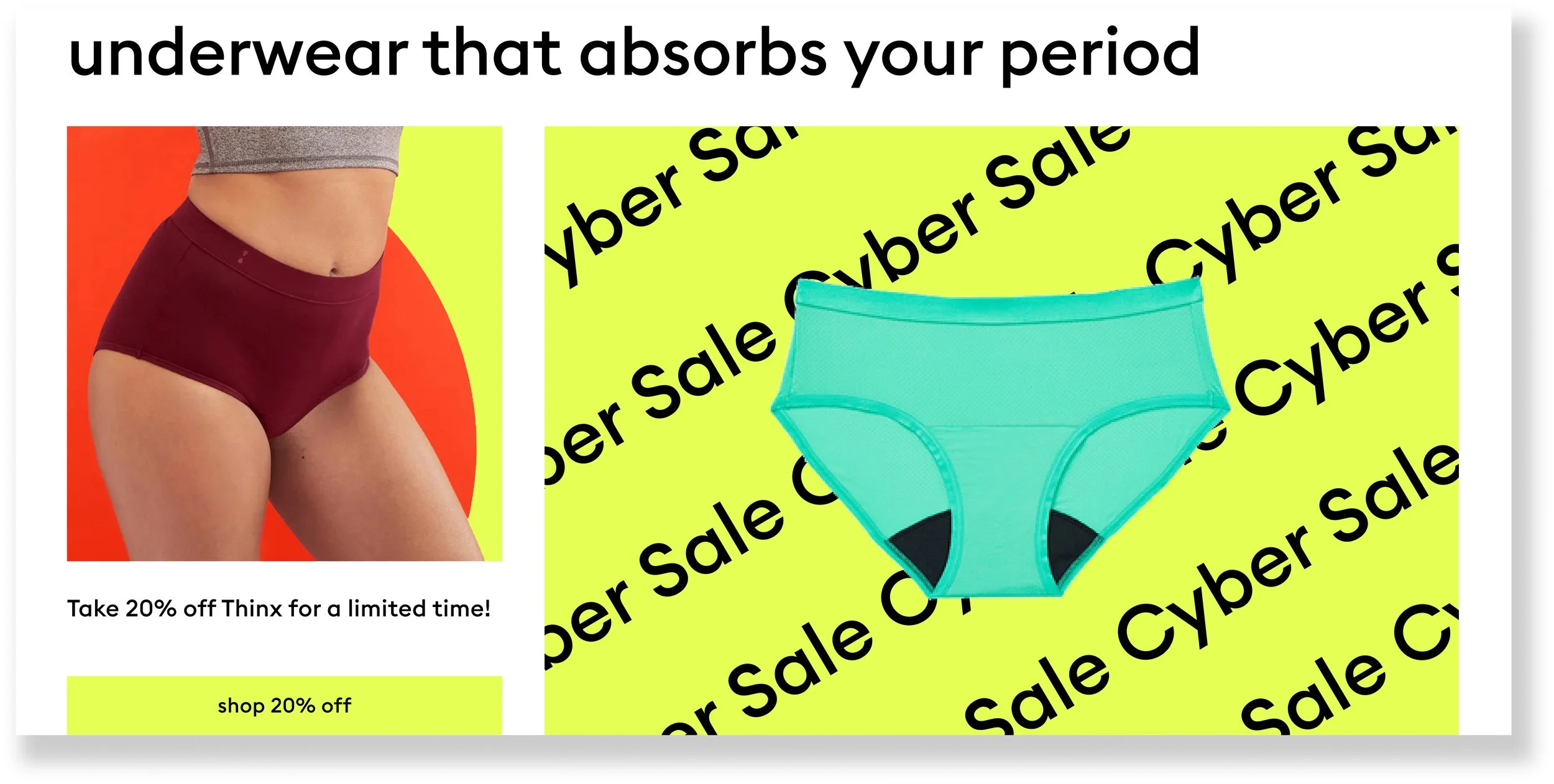
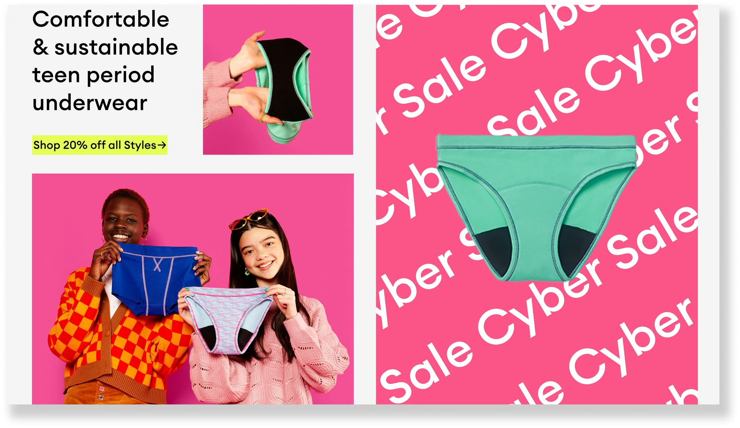
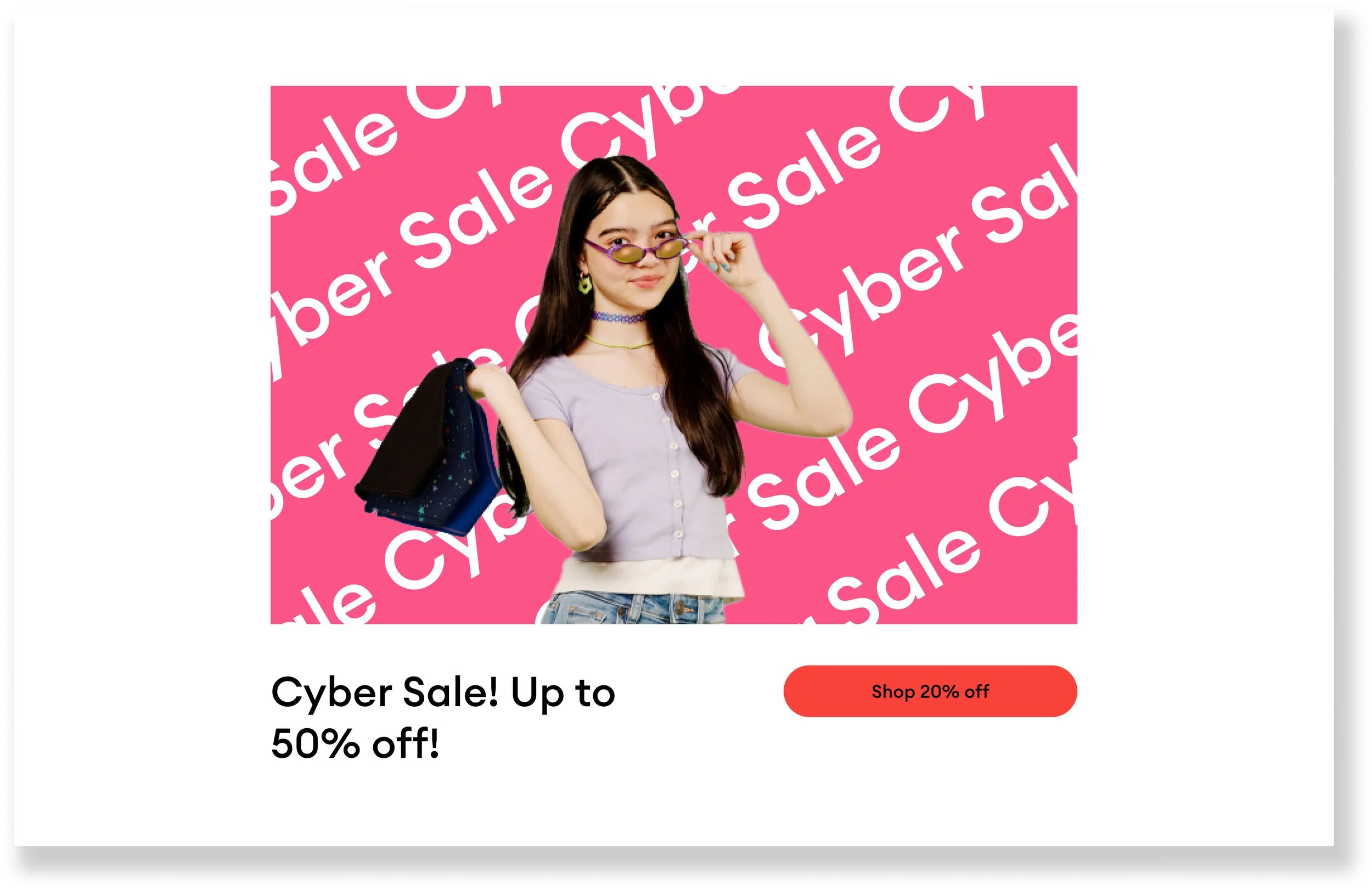
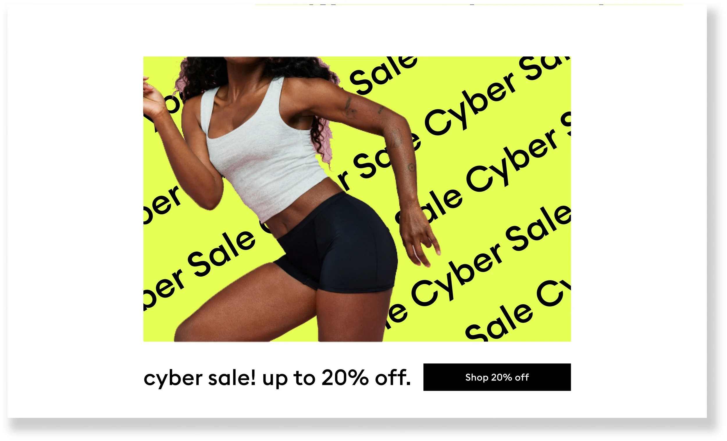
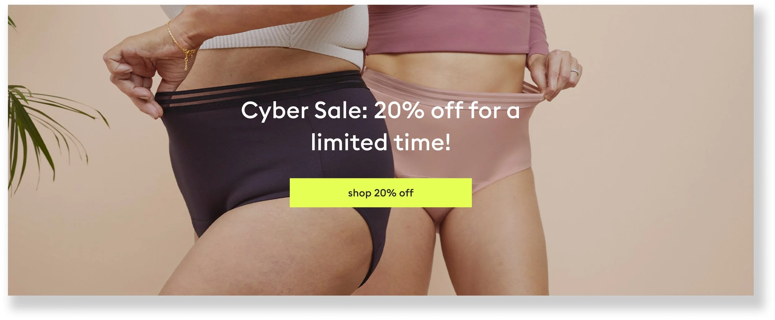
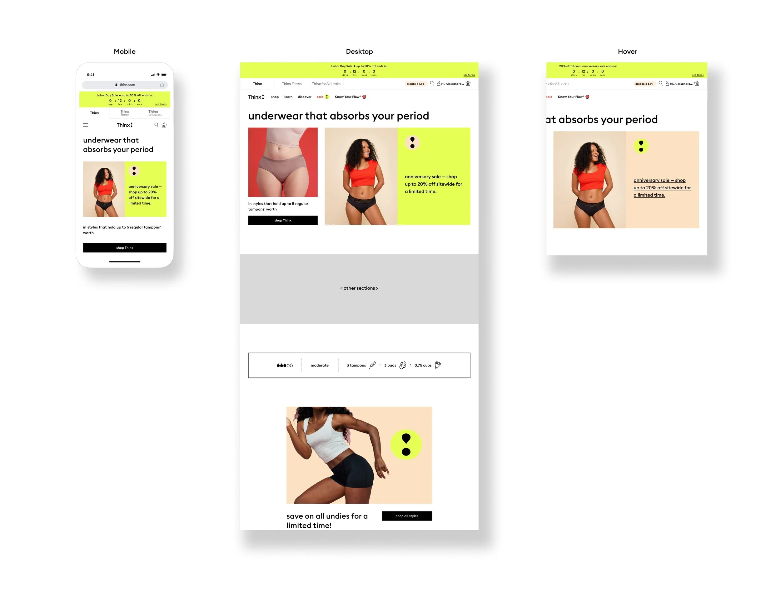
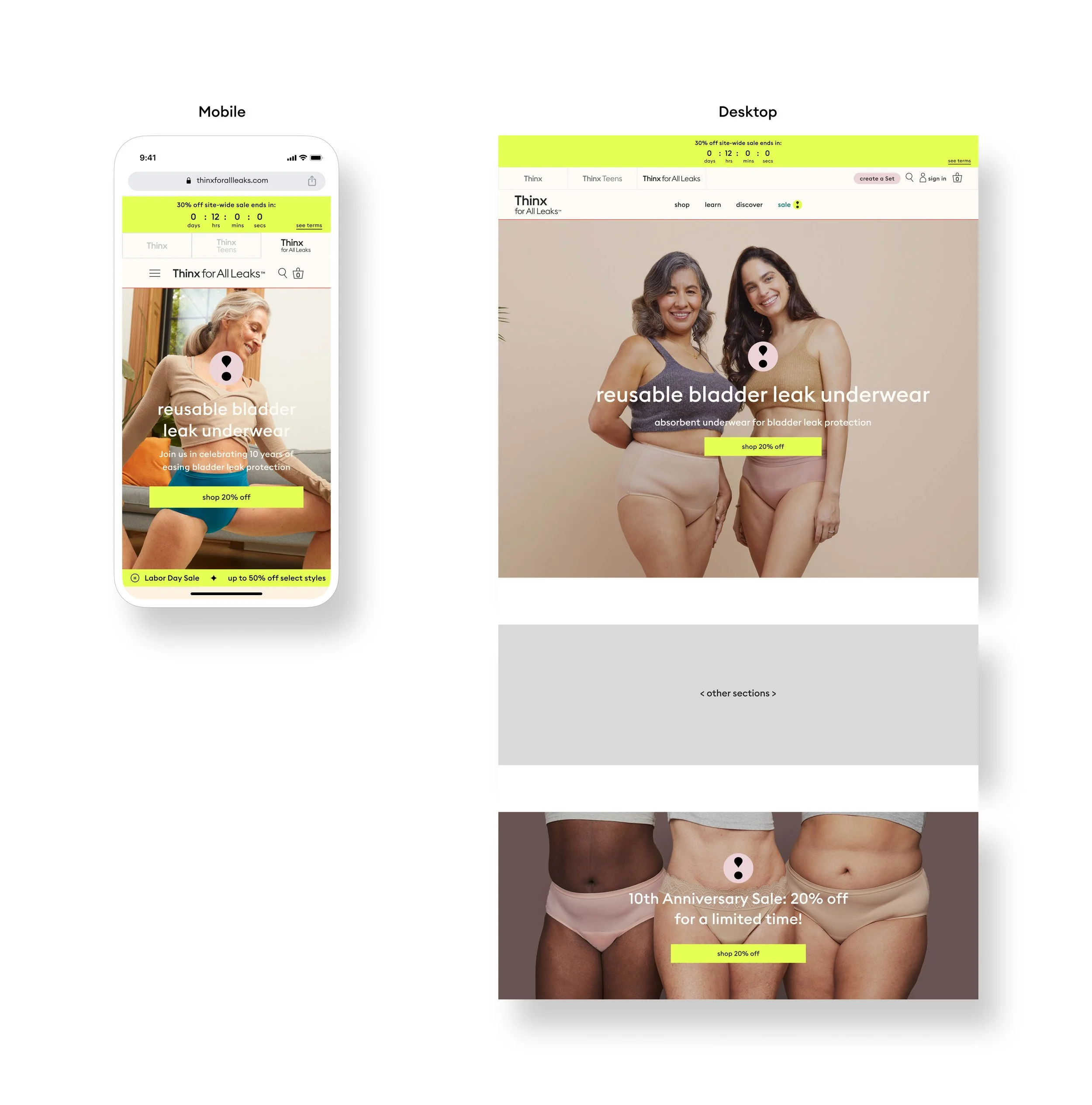
Just my type template:
This template leverages sale messaging with a hero that combines product image, live text, and the sale badge. Easily A/B test copy and build a cross-brand shop experience with a prominent highlight color and sale badge that appears across all brand homepages. Thinx and Thinx Teens heroes offer an easter egg hover state on desktop screens and linking text on all breakpoints
Thinx
Thinx Teens

Thinx for All Leaks
Other projects
-
Shipt Guided
-

Coca-Cola Campaign
Contact me
Do you want to create work together? Let’s connect and collaborate on creating something impactful that has the potential to positively change the lives of many throughout the world!