Coca-Cola Campaign
Coca-Cola is one of the most well-known soda brands of all time. I wanted to create a campaign to celebrate and appreciate this long lasting brand that I have enjoyed throughout life.
Overview:
Role & Responsibilities:
Designer
Copywriter
2 weeks from start to finish
Strategy
Brainstorming ideas
Photoshop
For this project, the goal was to combine both classic visuals and classic copy to sizzle memories of old for the audience. With the use of the Coca-Cola bottle of the past, it was then my duty to create copy that will bring forth the nostalgic feelings and memories from viewers.
Task:
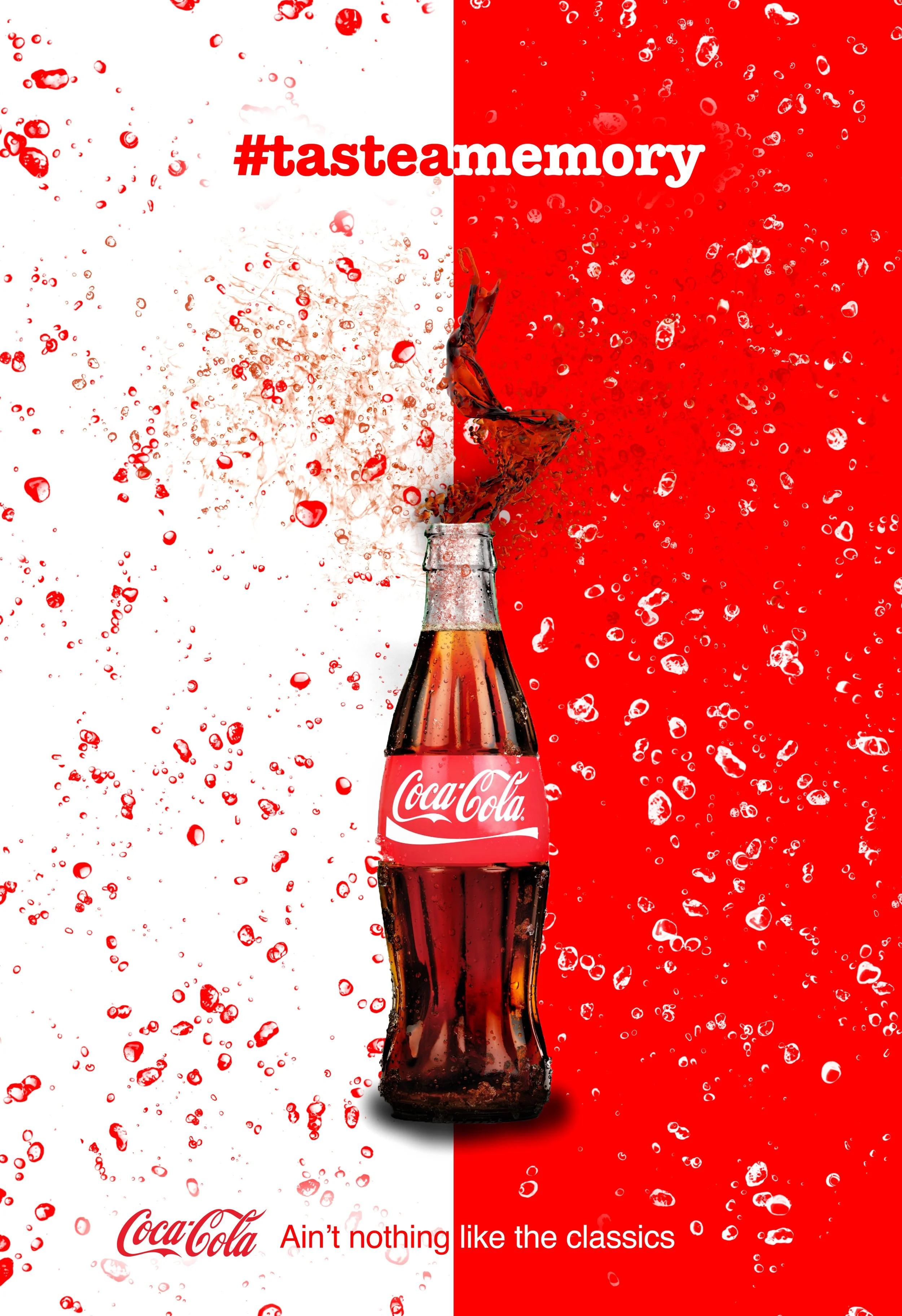
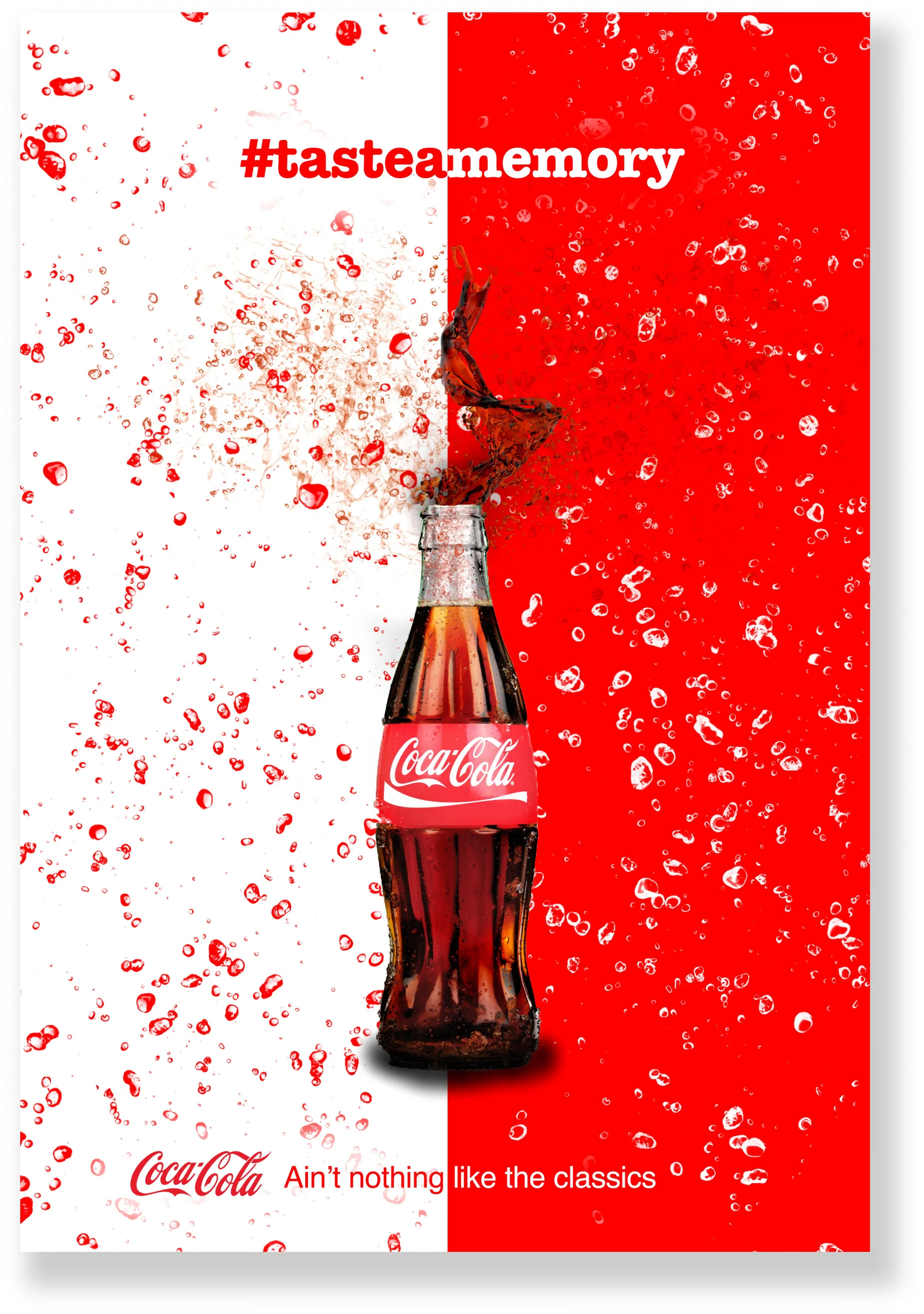
Poster 1:
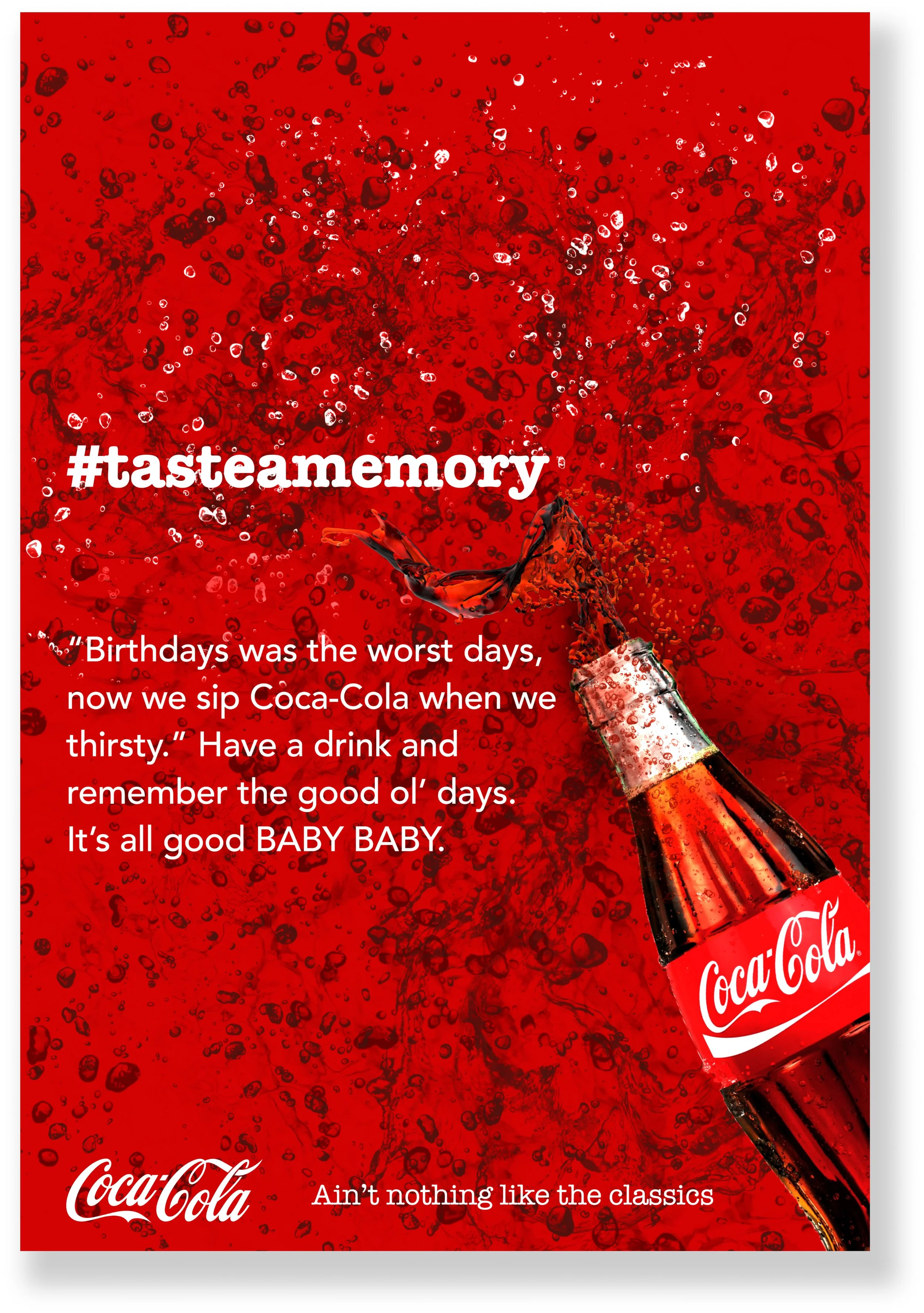
This poster merged Coca-Cola with music.
Reasons for choosing copy:
I selected these particular lyrics because they referenced drinking champagne. I substituted the word champagne with “Coca-Cola” to incorporate the brand into the lyrics. Additionally, I included the iconic phrase “It’s all good BABY BABY” from the song, as it is widely recognized and aligned well with the campaign’s objective.
Visuals:
Upon closer inspection of the splash emanating from the bottle, you’ll notice it bears a resemblance to the shape of a tongue. This is why I intentionally positioned it beneath the hasthag, #tasteamemory.
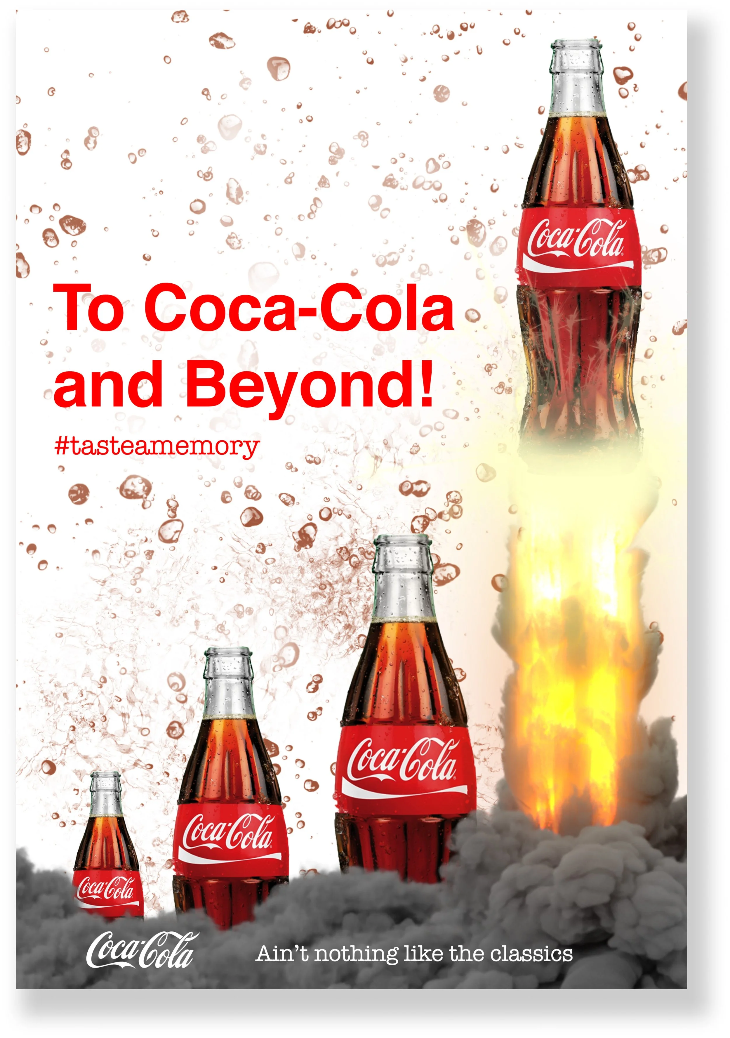
Poster 2:
This poster merged Coca-Cola with movies.
Reasons for choosing copy:
In the headline, I substituted “infinity” with “Coca-Cola” to integrate the brand with the famous quote from the movie, Toy Story. Then, in the body, I incorporated keywords like “lightyears” and “story” to establish a connection with the movie.
Visuals:
I enlarged the size of each bottle to establish a visual connection between the bottles and the headline. Additionally, I tilted the last bottle to correspond with the concluding sentence in the body, “Cheers to the classics,” and to align with the first poster, which also featured a tilted bottle.

Poster 2: Version 2
This poster merged Coca-Cola with movies.
Reasons for a second version:
Viewers observed that the visuals in this poster enhanced the connection with the headline and added an extra element of excitement to the overall appearance. Nonetheless, some feedback suggested that this visual approach seemed somewhat disconnected from the other posters.
Poster 3:
The poster to tie it all together
Reasons for this poster:
This poster was designed to serve as the primary representation of the campaign, acting as the “face” that links all three posters together, ensuring that everyone recognizes they are part of the same campaign.
Outcomes & Lessons:
The campaign received positive feedback, with praise for both the visual designs and the copywriting. Additionally, many people mentioned how it evoked nostalgic memories for them.
I hope to embark on more work like this, it was truly fun.
Other projects
-

Thinx Sale Design System
-
Shipt Guided
Contact me
Do you want to create work together? Let’s connect and collaborate on creating something impactful that has the potential to positively change the lives of many throughout the world!